Svelte Gallery (Mansonry) - Flowbite
Use the image gallery component based on a masonry grid layout using flex and grid classes from Tailwind CSS to show multiple pictures based on various styles
The gallery component can be used to show multiple images inside a masonry grid layout styles with the utility-first classes from Tailwind CSS to show a collection of pictures to your users based on various layouts, styles, sizes, and colors.
This component is recommended for usage within marketing UI interfaces and website sections when you want to show pictures of your team members, office pictures, or even case study images.
Set up #
Import Gallery and GalleryItem in the script tag.
<script>
  import { Gallery, GalleryItem } from "flowbite-svelte";
</script>
Default gallery #
Use this component to show a collection of images inside a gallery with three pictures on a row.

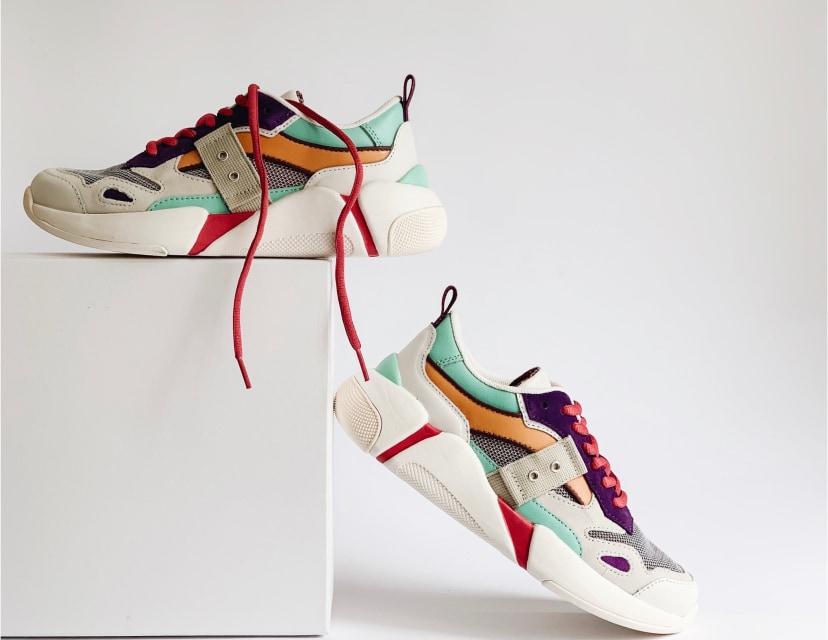
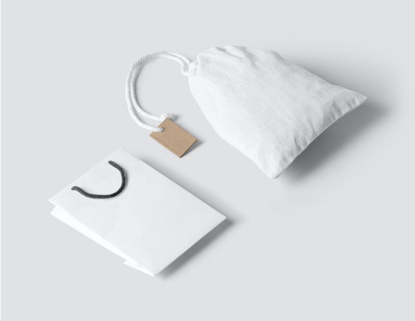
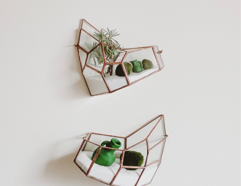
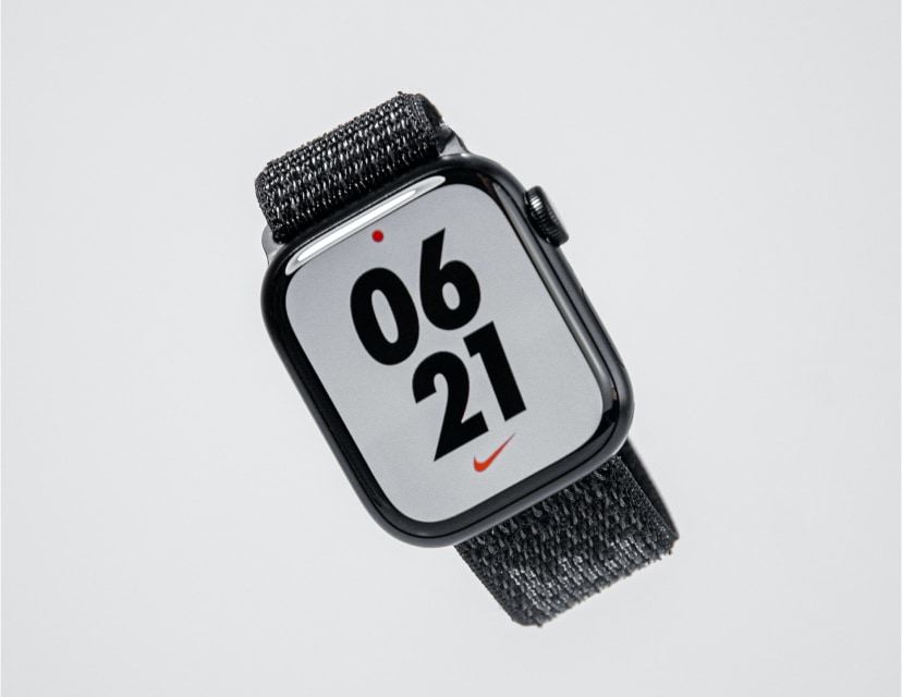
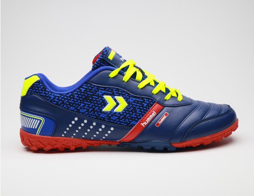


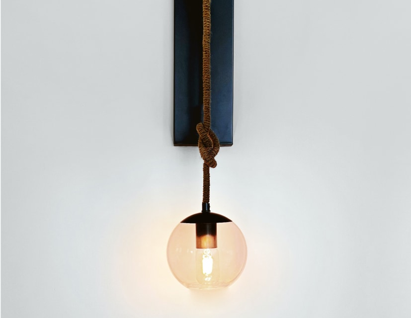
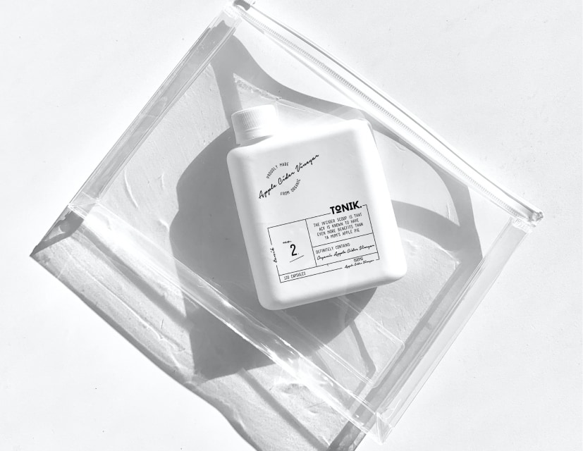

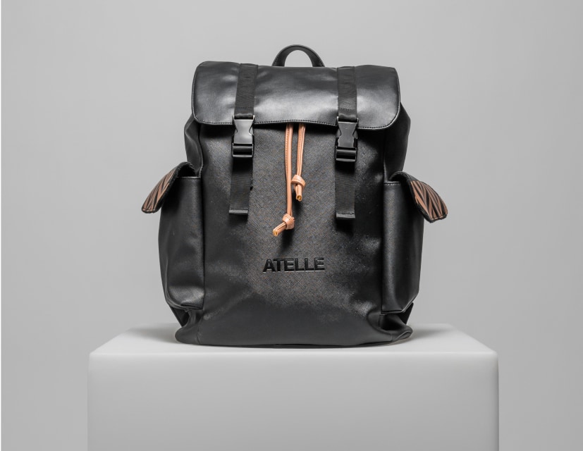
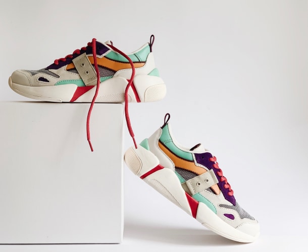
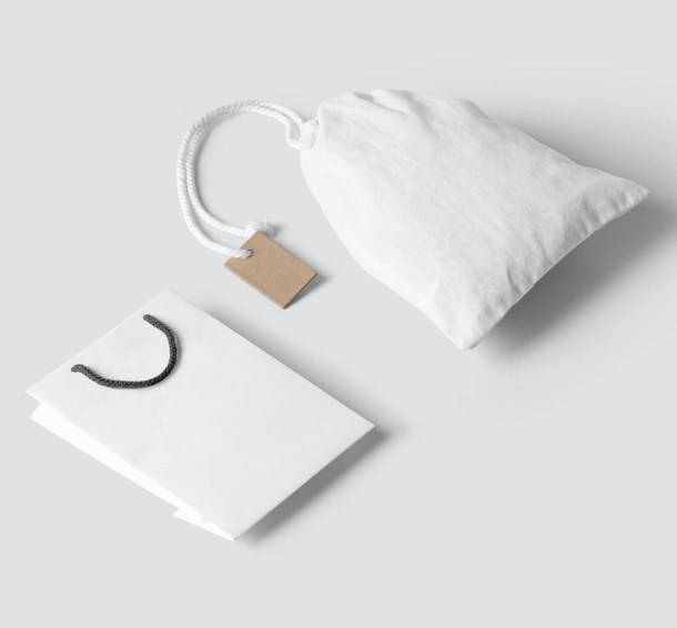
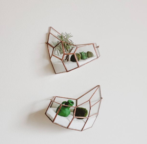
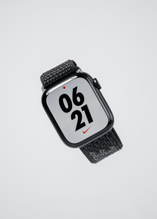
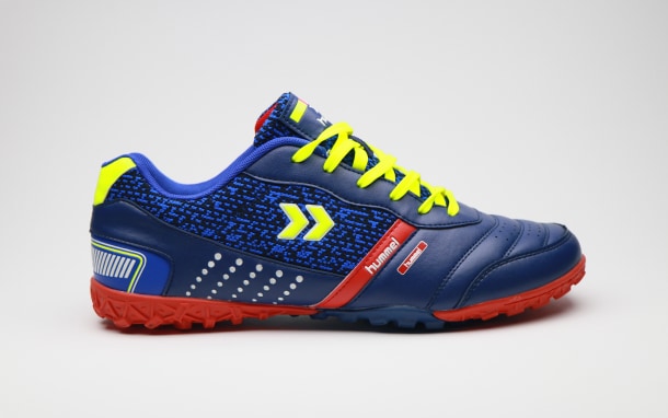
<script>
  import { Gallery, GalleryItem } from "flowbite-svelte";
  const images = [
    {
      src: 'https://flowbite.s3.amazonaws.com/docs/gallery/square/image.jpg',
      alt: 'erbology'
    },
    {
      src: 'https://flowbite.s3.amazonaws.com/docs/gallery/square/image-1.jpg',
      alt: 'shoes'
    },
    {
      src: 'https://flowbite.s3.amazonaws.com/docs/gallery/square/image-2.jpg',
      alt: 'small bag'
    },
    {
      src: 'https://flowbite.s3.amazonaws.com/docs/gallery/square/image-3.jpg',
      alt: 'plants'
    },
    {
      src: 'https://flowbite.s3.amazonaws.com/docs/gallery/square/image-4.jpg',
      alt: 'watch'
    },
    {
      src: 'https://flowbite.s3.amazonaws.com/docs/gallery/square/image-5.jpg',
      alt: 'shoe'
    },
    {
      src: 'https://flowbite.s3.amazonaws.com/docs/gallery/square/image-6.jpg',
      alt: 'cream'
    },
    {
      src: 'https://flowbite.s3.amazonaws.com/docs/gallery/square/image-7.jpg',
      alt: 'small bag'
    },
    {
      src: 'https://flowbite.s3.amazonaws.com/docs/gallery/square/image-8.jpg',
      alt: 'lamp'
    },
    {
      src: 'https://flowbite.s3.amazonaws.com/docs/gallery/square/image-9.jpg',
      alt: 'toiletbag'
    },
    {
      src: 'https://flowbite.s3.amazonaws.com/docs/gallery/square/image-10.jpg',
      alt: 'playstation'
    },
    {
      src: 'https://flowbite.s3.amazonaws.com/docs/gallery/square/image-11.jpg',
      alt: 'bag'
    }
  ]

</script>
<Gallery>
  {#each images as {src, alt}}
    <GalleryItem {src} {alt} />
  {/each}
</Gallery>
Masonry grid #
This example can be used to show the images inside a masongry grid layouts with four columns.


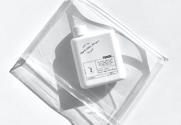


<script>
  import { Gallery, GalleryItem } from "flowbite-svelte";
  const images1 = [
    {
      src: 'https://flowbite.s3.amazonaws.com/docs/gallery/masonry/image.jpg',
      alt: 'erbology'
    },
    {
      src: 'https://flowbite.s3.amazonaws.com/docs/gallery/masonry/image-1.jpg',
      alt: 'shoes'
    },
    {
      src: 'https://flowbite.s3.amazonaws.com/docs/gallery/masonry/image-2.jpg',
      alt: 'small bag'
    },
  ]
   const images2 = [
    {
      src: 'https://flowbite.s3.amazonaws.com/docs/gallery/masonry/image-3.jpg',
      alt: 'plants'
    },
    {
      src: 'https://flowbite.s3.amazonaws.com/docs/gallery/masonry/image-4.jpg',
      alt: 'watch'
    },
    {
      src: 'https://flowbite.s3.amazonaws.com/docs/gallery/masonry/image-5.jpg',
      alt: 'shoe'
    },
   ]
   const images3 = [
    {
      src: 'https://flowbite.s3.amazonaws.com/docs/gallery/masonry/image-6.jpg',
      alt: 'cream'
    },
    {
      src: 'https://flowbite.s3.amazonaws.com/docs/gallery/masonry/image-7.jpg',
      alt: 'small bag'
    },
    {
      src: 'https://flowbite.s3.amazonaws.com/docs/gallery/masonry/image-8.jpg',
      alt: 'lamp'
    },
   ]
   const images4 = [
    {
      src: 'https://flowbite.s3.amazonaws.com/docs/gallery/masonry/image-9.jpg',
      alt: 'toiletbag'
    },
    {
      src: 'https://flowbite.s3.amazonaws.com/docs/gallery/masonry/image-10.jpg',
      alt: 'playstation'
    },
    {
      src: 'https://flowbite.s3.amazonaws.com/docs/gallery/masonry/image-11.jpg',
      alt: 'bag'
    }
  ]

</script>
<Gallery colClass="grid-cols-2 md:grid-cols-4">
  <div class="grid gap-4">
  {#each images1 as {src, alt}}
    <GalleryItem {src} {alt} />
  {/each}
  </div>
    <div class="grid gap-4">
  {#each images2 as {src, alt}}
    <GalleryItem {src} {alt} />
  {/each}
  </div>
  <div class="grid gap-4">
  {#each images3 as {src, alt}}
    <GalleryItem {src} {alt} />
  {/each}
  </div>
    <div class="grid gap-4">
  {#each images4 as {src, alt}}
    <GalleryItem {src} {alt} />
  {/each}
  </div>
</Gallery>
Featured image #
This example can be used to feature the most important image and show a row of five pictures below.

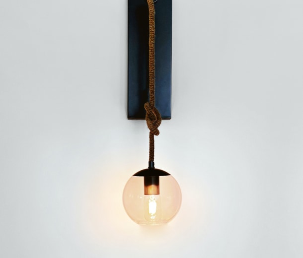
<script>
  import { Gallery, GalleryItem } from "flowbite-svelte";
  const image1 = {
    src: 'https://flowbite.s3.amazonaws.com/docs/gallery/featured/image.jpg',
    alt: 'erbology'
  }
  const images2 = [
    {
      src: 'https://flowbite.s3.amazonaws.com/docs/gallery/square/image-1.jpg',
      alt: 'shoes'
    },
    {
      src: 'https://flowbite.s3.amazonaws.com/docs/gallery/square/image-2.jpg',
      alt: 'small bag'
    },
    {
      src: 'https://flowbite.s3.amazonaws.com/docs/gallery/square/image-3.jpg',
      alt: 'plants'
    },
    {
      src: 'https://flowbite.s3.amazonaws.com/docs/gallery/square/image-4.jpg',
      alt: 'watch'
    },
    {
      src: 'https://flowbite.s3.amazonaws.com/docs/gallery/square/image-5.jpg',
      alt: 'shoe'
    },
  ]

</script>

<div class="grid gap-4">
  <GalleryItem src={image1.src} alt={image1.alt} />
<Gallery colClass="grid-cols-5">
  {#each images2 as {src, alt}}
    <GalleryItem {src} {alt} />
  {/each}
</Gallery>
</div>
Quad gallery #
Use this example to show four larger images with two items on a row.
<script>
  import { Gallery, GalleryItem } from "flowbite-svelte";

  const images = [
    {
      src: 'https://flowbite.s3.amazonaws.com/docs/gallery/square/image-1.jpg',
      alt: 'shoes'
    },
    {
      src: 'https://flowbite.s3.amazonaws.com/docs/gallery/square/image-2.jpg',
      alt: 'small bag'
    },
    {
      src: 'https://flowbite.s3.amazonaws.com/docs/gallery/square/image-3.jpg',
      alt: 'plants'
    },
    {
      src: 'https://flowbite.s3.amazonaws.com/docs/gallery/square/image-4.jpg',
      alt: 'watch'
    }
  ]
</script>

<Gallery colClass="grid-cols-2" outerDivClass="grid gap-2">
  {#each images as {src, alt}}
    <GalleryItem {src} {alt} />
  {/each}
</Gallery>
Gallery with slider #
This example uses the carousel slider functionality to show multiple images inside a slider gallery.

<script>
  import { CarouselTransition } from 'flowbite-svelte'
  let showThumbs=false
  let showCaptions=false
  let showIndicators=false
  const images = [
    {
      id: 0,
      imgurl: '/images/carousel/cosmic-timetraveler-pYyOZ8q7AII-unsplash.webp',
      attribution: 'shoes'
    },
    {
      id: 1,
      imgurl: '/images/carousel/cristina-gottardi-CSpjU6hYo_0-unsplash.webp',
      attribution: 'small bag'
    },
    {
      id: 2,
      imgurl: '/images/carousel/johannes-plenio-RwHv7LgeC7s-unsplash.webp',
      attribution: 'plants'
    },
    {
      id: 3,
      imgurl: '/images/carousel/jonatan-pie-3l3RwQdHRHg-unsplash.webp',
      attribution: 'watch'
    },
    {
      id: 4,
      imgurl: '/images/carousel/mark-harpur-K2s_YE031CA-unsplash.webp',
      attribution: 'watch'
    }
  ]
</script>

<div class="max-w-4xl">
  <CarouselTransition {images} loop {showThumbs} {showCaptions} {showIndicators} transitionType="fly" transitionParams="{{delay: 250, duration: 300, x: 100}}"/>
</div>
Props #
The component has the following props, type, and default values. See types page for type information.
Gallery
| Name | Type | Default |
|---|---|---|
| outerDivClass | string | 'grid gap-4' |
| colClass | string | 'grid-cols-2 md:grid-cols-3' |
GalleryItem
| Name | Type | Default |
|---|---|---|
| src | string | '' |
| alt | string | '' |
| imgClass | string | 'h-auto max-w-full rounded-lg' |